
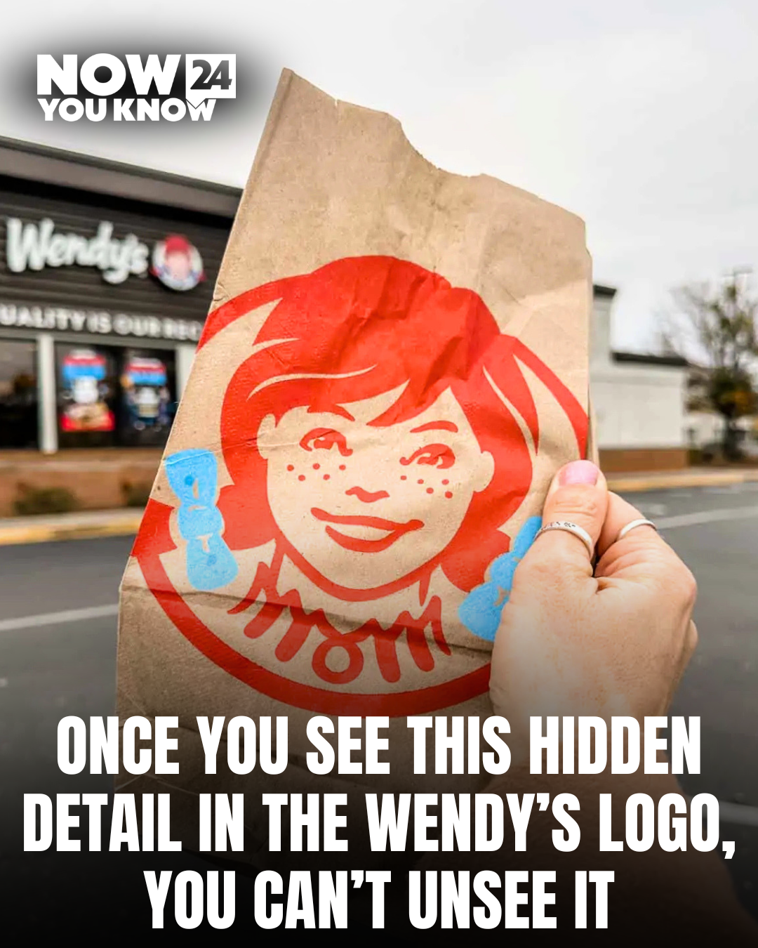
Most people recognize Wendy’s instantly — the red-haired mascot, the blue dress, and the familiar fast food brand that has been around for decades. But many customers are surprised when they learn there may be a hidden message in the logo that has been there the entire time.
If you look closely at the collar on Wendy’s blue dress in the logo, many people believe the word “MOM” can be seen subtly formed in the design. The detail is small and easy to miss, which is why many customers say they never noticed it despite seeing the logo for years.
The hidden detail is often said to represent the idea of home-cooked comfort food, suggesting meals made with care and a homemade feel rather than typical fast food. The brand has long focused on fresh ingredients and a more traditional approach to burgers and meals.
Over the years, the logo detail has sparked discussions online, with customers debating whether the hidden word was intentional or simply a coincidence. Some branding experts say hidden messages in logos are often used to create emotional connections with customers.
Whether intentional or not, the small design detail has become one of those things people cannot unsee once it is pointed out. Many customers say it completely changed how they look at the logo.
Next time you see a Wendy’s sign or packaging, take a closer look at the collar — you might notice something that has been hiding in plain sight for years.